Everlaw
Improving clustering data visualization
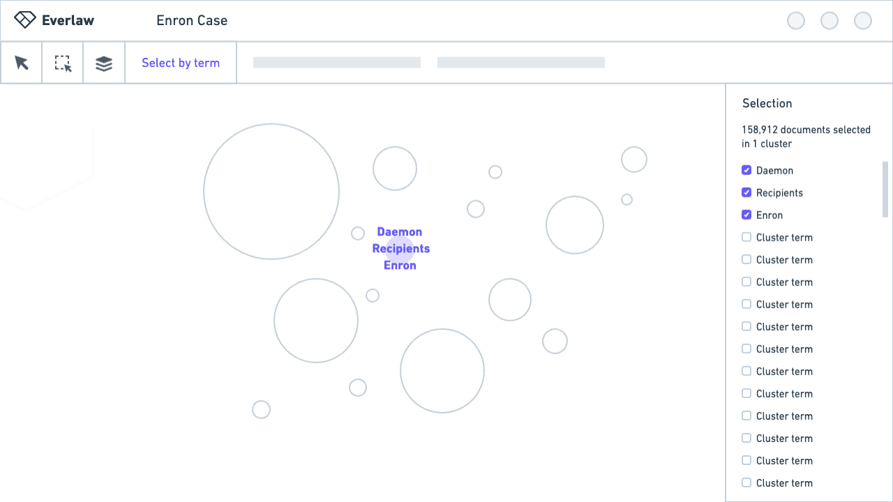
Sifting through millions of documents is daunting. In a world where people are generating more data than ever, identifying evidence is getting harder for legal teams. To reduce the time and effort it takes to understand documents, we built key improvements to Everlaw's clustering AI data visualization.
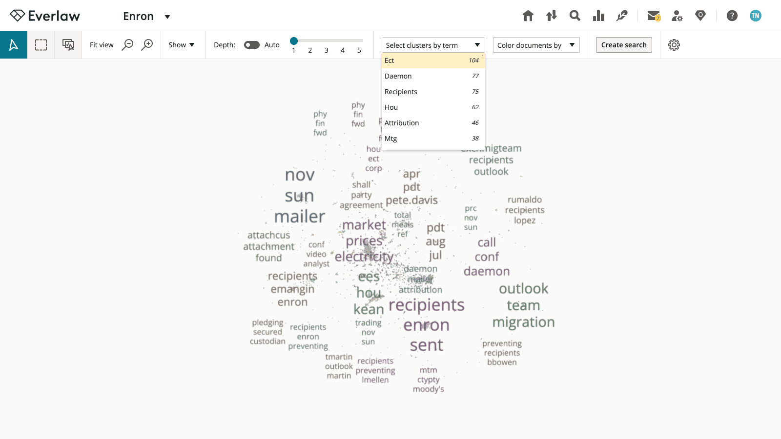
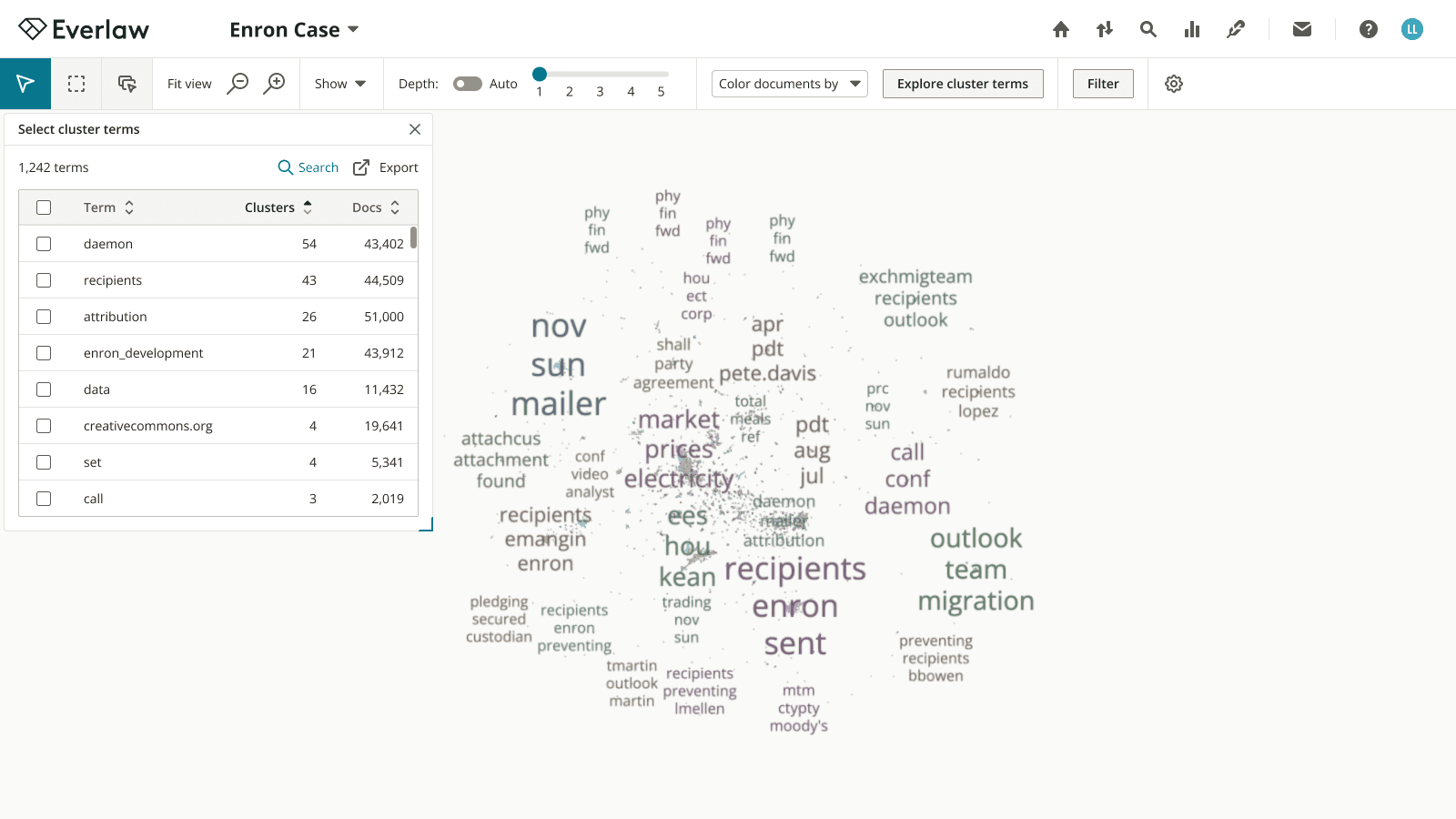
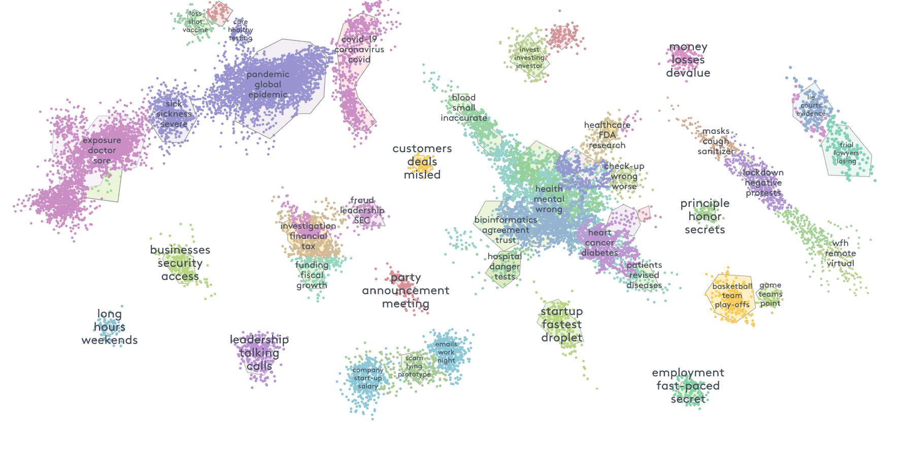
The current clustering interface focuses on large shapes of data, making it difficult to dig down and investigate individual terms identified by machine learning, and tedious to take action with terms of interest. This was especially critical for a strategic client who raised this issue, wanting to use the clustering tool on a 3 million document case.
Users need to better understand trends in their data by investigating cluster terms at scale, with a unified experience to make those insights actionable.
To solve that problem, I made two key changes.
End solution
At the beginning of the project, I knew we were faced with immediate user need, such as a client needing to support a 3 million document database. Despite it being a fast-paced project, I was able to complete several forms of research:
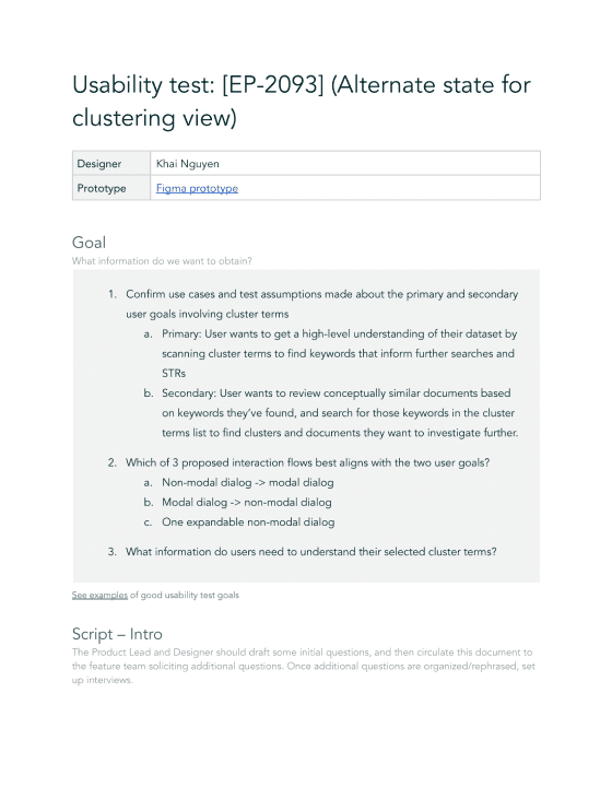
Usability tests on the current state (and later, on wireframes)
Secondary research via existing user interviews
The Product Lead and I identified some recurring sentiment among legal teams:
Research helped me chart a user flow to visualize our assumptions around exploring cluster terms. Here we identified additional value-adds, such as exporting cluster terms. This was a user need not captured in the original project definition, but our interviews had identified a minority of users with ~1000+ terms and preference for off-platform tools.
As a designer, understanding how to balance UX with business and technical constraints is crucial. We knew the level of tooling desired by this user segment would be infeasible to develop. So rather than blow up scope, we proposed the export feature to provide value quickly by enabling users to analyze off-platform.
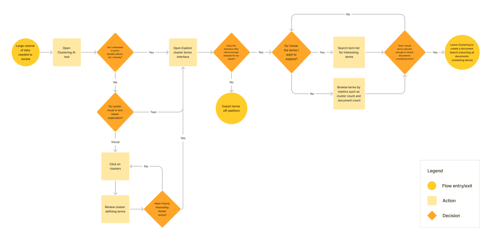
User flow
Informed by the user flow, I delved into wireframes to rapidly ideate. The goal was to enable investigation of cluster terms at scale, which our research defined to mean:
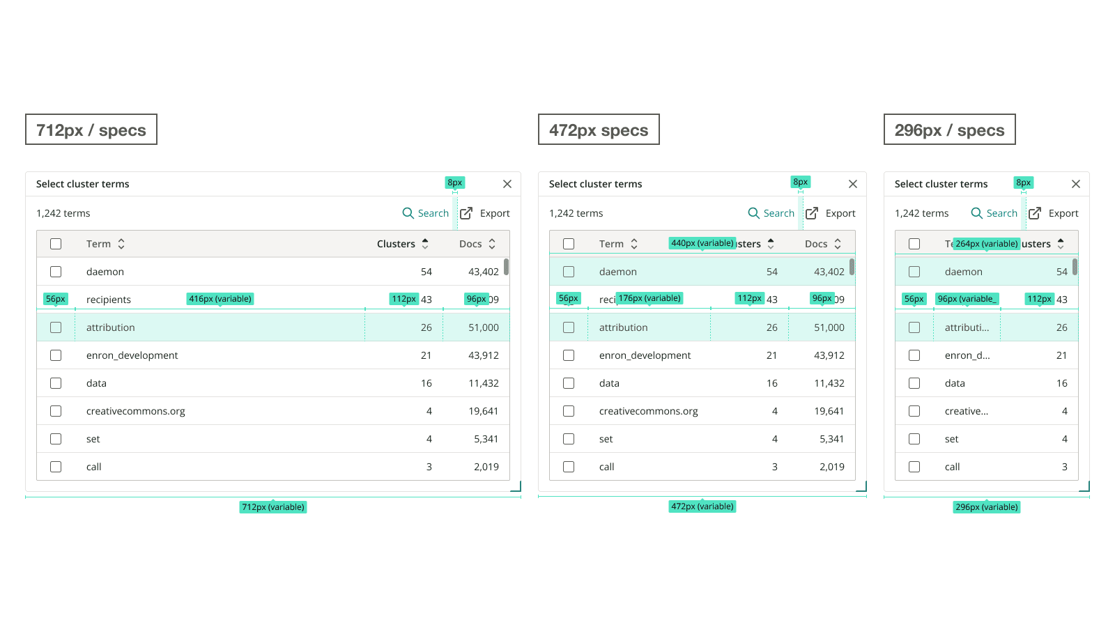
Greater space for users to browse terms
Clear indication of which terms have been selected
Deeper context to determine which terms are most relevant
Wireframes
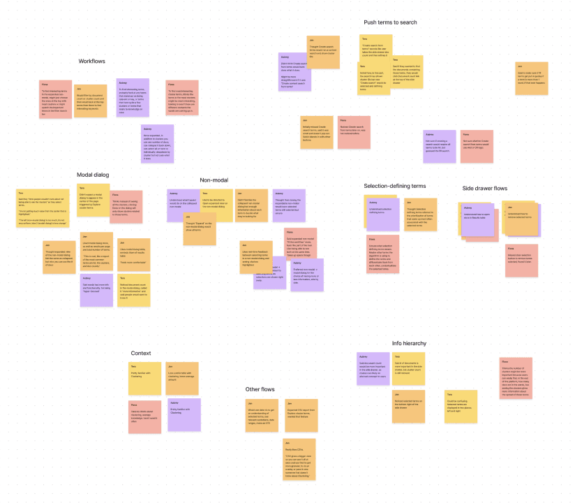
To explore these ideas, I led several more usability tests, this time with Figma prototypes. We learned people felt less cognitive load with a dialog, but thought it was tedious to switch back and forth between the visualization and selection state.
It's also critical to my process to solicit feedback early and often. I brought this project to design critiques with other designers, and meetings with company leadership.
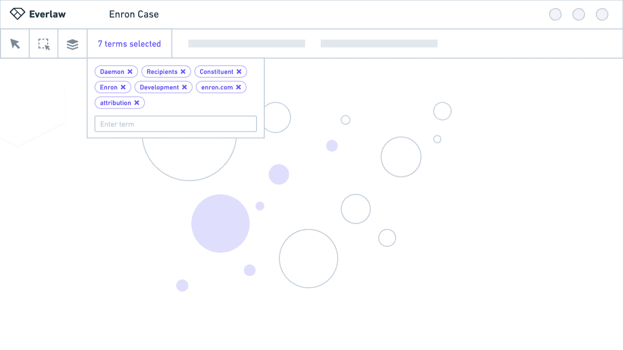
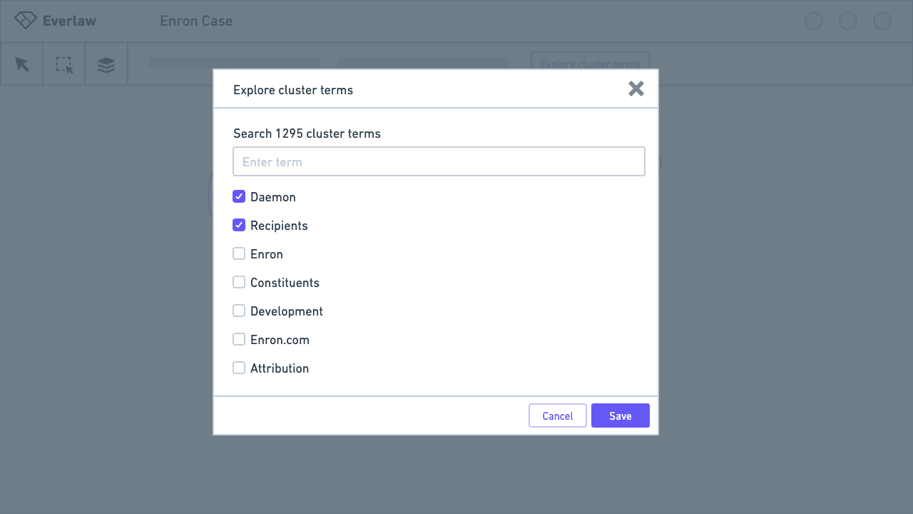
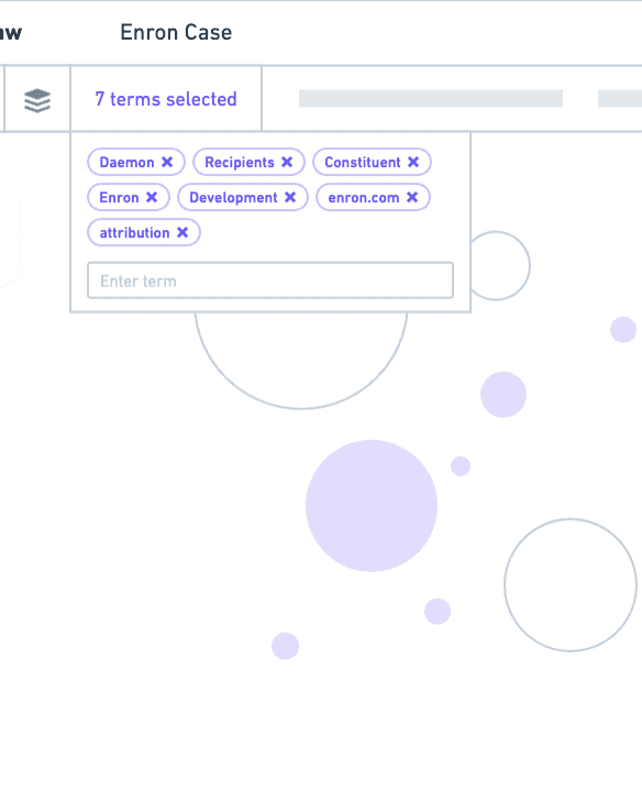
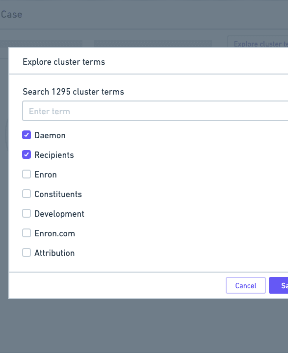
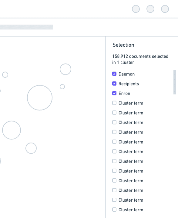
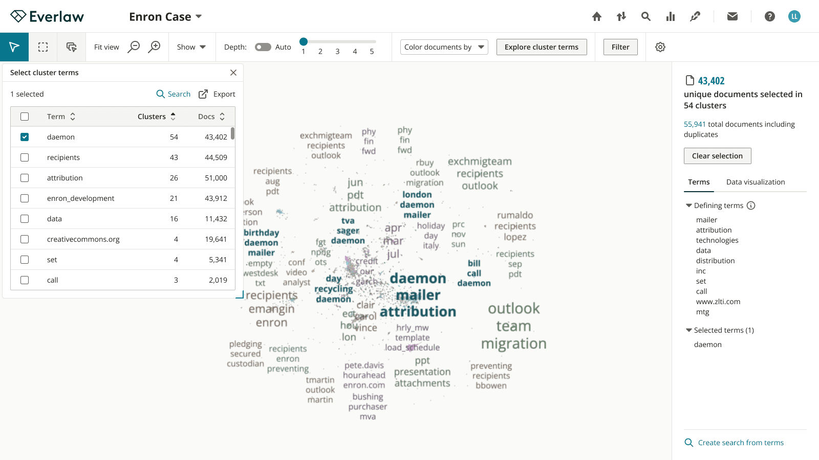
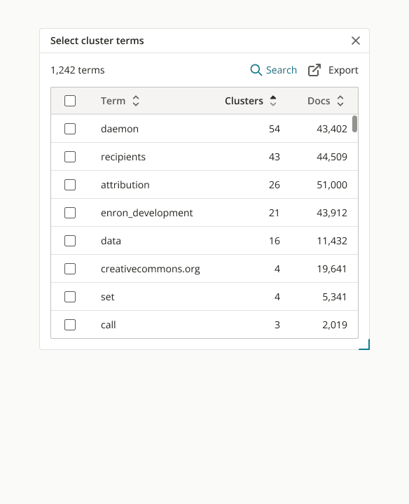
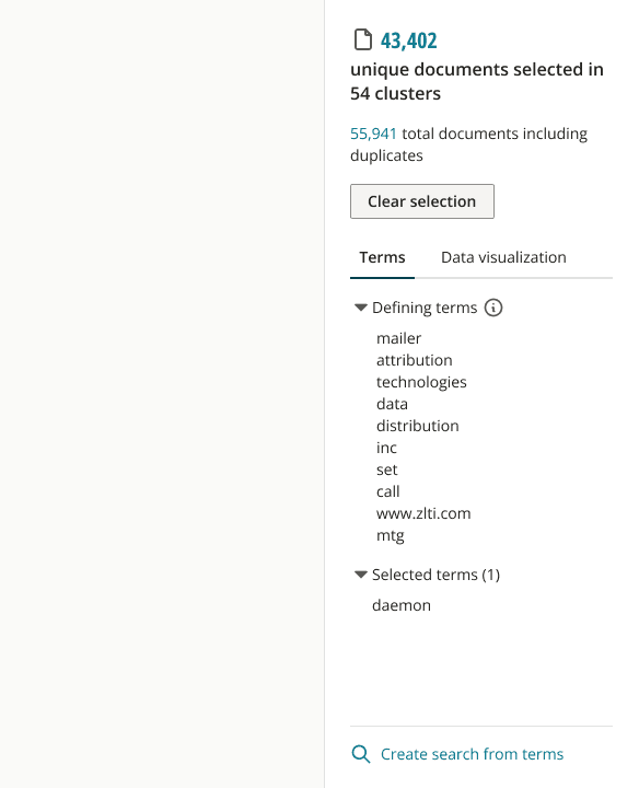
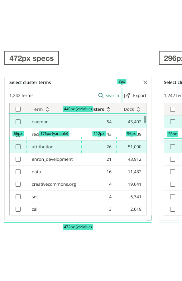
Through iteration, with design decisions informed by testing and feedback, I designed a solution that features cluster terms in a non-modal dialog, and an updated selection state to show selected terms and the actions users can take with them.
High-fidelity
We shipped this feature in time for the strategic client’s use on the 3 million document case, and received positive feedback. In addition, the PM and I defined several metrics for collection to continue monitoring the response to the improvement:
Click rate for the cluster term dialog to see how often users are relying on analysis via on-platform tools
Frequency at which users are exporting terms
This project was a learning experience; as I learned through user interviews, simply showing users the data and output from AI isn't enough. When designing for complex data visualizations or system outputs, it's essential to build trust into the system and make that data actionable.

